
Data visualization ace seeds ideas and inspiration for next year’s census data

A data visualization expert says the time is ripe to tell rich, interactive news stories about health, particularly with new census data set to be released next year.
Aaron Williams, a former investigative data journalist with The Washington Post who now works for Netflix, shared innovative methods for how he has used the census for projects on racial segregation, COVID-related health disparities and the opioid epidemic during last week’s 2020 Data Fellowship.
“There’s just a ton of room in this space to do really great reporting,” he told fellows via Zoom.
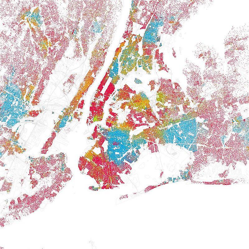
Williams traces this type of work dates back to W.E.B. Du Bois, sharing a 1936 quote from the civil rights leader and historian: “The modern way of showing progress of groups of people is by a series of very carefully thought-out charts, diagrams, models, etc.”
Around the turn of the 20th century, Du Bois made a map showing the population distribution of African Americans around the country. More than 100 years later, Williams updated Du Bois’ map and used the “entropy index” technique to visualize segregation in the United States. Readers could zoom in on their neighborhoods to see the racial makeup and how it’s changed over the years.
“It speaks to the power of what you can do with the census,” Williams said.
He suggested that in 2021 journalists utilize census data to examine urbanization, rural decline and what he called “the future of community.” In recent years, populations have been migrating back toward dense urban areas, impacting everything from tax revenue to housing costs, while rural parts of the country have become more diverse.
“I’m really excited for the 2020 census,” Williams said. “If you're interested in the future of America and the future of the people here, you're right now at the perfect time to start getting into this data, because it's going to really define both (what) we as journalists and what researchers, policymakers and many others think about for the next decade.”
He had already been analyzing data about demographic shifts leading up to the 2020 election when George Floyd was killed this spring in Minneapolis. Williams used that database, which was born out of annual population estimates from the census, for a story about how the protests over Floyd’s death were happening in unlikely places, like a small town in Iowa.
Williams also explained how, early on in the COVID-19 pandemic, he used data to visualize the virus’s potential impacts.
He took the health conditions identified by the Centers for Disease Control and Prevention as risk factors for COVID-19 and, utilizing data from the CDC’s Behavioral Risk Factor Surveillance System, mapped where in the U.S. they were most prevalent. Those neighborhoods were most likely to be located in communities of color, his analysis found.
Williams also recommended the CDC’s 500 Cities Project as another good source for health-related data, though he noted it includes only the 500 largest cities in America, excluding rural areas.
“We've got to do more than just cover cities,” he said. “You have to think about suburbs, rural, exurbs — all these other geographies that can be impacted.” For those regions, he suggested a data analysis group called PolicyMap.
He is also a fan of the CDC Social Vulnerability Index from the Agency for Toxic Substances and Disease Registry, which uses census data to assess the social vulnerability of households from measures like how crowded they are, whether they speak English and their access to vehicles.
Williams has also worked with the Drug Enforcement Administration’s Automated Reports and Consolidated Ordering System, or ARCOS, to map which pharmacies were distributing the most opioid painkillers.
Like nearly all data projects, that one had limitations, he noted. For one, not everyone lives within a short distance of their pharmacy, meaning the data couldn’t show exactly where the pills ended up. Also, just because a place prescribed a lot of opioids doesn’t mean it was doing anything nefarious. One of the top distributors in Illinois, for instance, largely treats cancer patients.
“Interrogate your ideas, interrogate your visualizations, because there might be more than just what, visually, you put across,” Williams said.
He also noted that the 2020 census itself is now a story, as the Supreme Court recently heard a challenge from the Trump administration to exclude undocumented immigrants from the count for the first time ever.
“This year has introduced all kinds of variables that no one anticipated. It depends on what your reporting attitude is. You can come out of this year, thinking, ‘Oh god, this is a nightmare. What are we going to do?’ You could also come out of it thinking, ‘Well, there's a lot to get done.’ And that's how I feel about it. There's so much you can do with this data. The fact that it's collected at all at the level it is is kind of a miracle. And so take advantage of it and use it as much as you can in your reporting.”