Cool Tools: Mapping HIV/AIDS, Tuberculosis and Other Diseases in Your Community

First in a series of posts on tools for reporters, bloggers, activists and others interested in communicating about health.
I just came across this interactive atlas from the CDC's National Center for HIV/AIDS, Viral Hepatitis, STD, and TB Prevention (NCHHSTP). It's a neat tool for looking at how HIV and AIDS, sexually transmitted diseases, viral hepatitis, and tuberculosis have changed in your state over the last decade or so.
In the future, the CDC plans to add county-level data and information on patients' economic and demographic status, as well as information about disease testing programs.
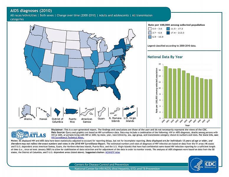
The Atlas includes data from 2000 to 2010 on HIV diagnoses, people living with HIV and HIV deaths, similar data for AIDS cases, statistics for sexually transmitted diseases (which are on the rise in Calif.), Hepatitis A, B and C and tuberculosis. A particularly interesting feature is the "play" button in the upper right hand corner which graphically shows each state's disease rates rising and falling over a decade. Here's what the atlas looks like:

And here's a video tutorial:
[video:http://youtu.be/miDHa9qo5YA width:300 height:200]
This tool can help you identify which diseases are on the rise in your state, and which are being better controlled through public health interventions. The stakes are high: tuberculosis and gonorrhea, among other infectious diseases, are becoming less and less treatable with antibiotics, spelling major trouble ahead for patients and their doctors.
In future posts, I'll highlight other great visualization, mapping, data and multimedia tools for your work.
Related Content:
Herd Immunity: Mapping MRSA and Other Superbugs, One Case at a Time
Google Mapping for Journalists 101

