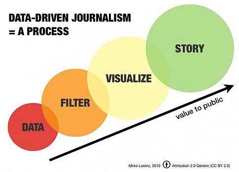
Find Health Stories with Health Data Webinar on Wednesday

We are awash in health data. Making sense of it is the true challenge.
One increasingly popular way is through data visualizations. One of the pioneers in this regard has been the place where I work, the Institute for Health Metrics and Evaluation. You don’t have to take my word for it, though. A man who knows a thing or two about technological breakthroughs – Bill Gates – said earlier this year: “In the whole world of data visualization, this tool is one of the best efforts that’s ever been done.”
He was talking about the suite of visualizations IHME created to showcase the Global Burden of Disease: 1 billion estimates for levels and trends in health by age, sex, location and year for 187 countries worldwide. Want to see deaths linked to sugar sweetened beverages in the United States? You can do that. Want to see the impact of depression globally? You can do that. Want to see how young men are being wiped out by violence throughout Latin America? You can do that, too.
Through a partnership with the Solutions Journalism Network, IHME will be conducting a free one-hour interactive webinar on Wednesday, June 12 at 12 p.m. EST/9 a.m. PST. It will be hosted by Tina Rosenberg, co-founder of the Solutions Journalism Network and co-author of the New York Times “Fixes” column, and by me. (Archived here.)
Sarika Bansal, the network’s director of partnerships and a terrific journalist, wrote recently about the webinar, saying, “We welcome attendance from anyone interested in learning how to use data to tell rigorous and compelling stories about global health.”
I would add that you can write about local health, too. The estimates are at the country level, meaning you can compare the United States to the U.K. to China to India to just about anywhere you choose. Here are a few recent examples.
Tony Dokoupil at Newsweek mined the data to find creative ways to explain the growing problem of suicide in the United States and elsewhere. He wrote:
Throughout the developed world, for example, self-harm is now the leading cause of death for people 15 to 49, surpassing all cancers and heart disease. That’s a dizzying change, a milestone that shows just how effective we are at fighting disease, and just how haunted we remain at the same time. Around the world, in 2010 self-harm took more lives than war, murder, and natural disasters combined, stealing more than 36 million years of healthy life across all ages. In more advanced countries, only three diseases on the planet do more harm.
Michaeleen Doucleff at NPR used the data visualizations for her reporting on how, despite all of its health care woes, the United States seems to be doing something right when it comes to cancer care. She wrote:
When it comes to the state of the nation’s health, the U.S. seems to get one poor grade after another. Despite spending more on health care, we've been slipping behind other high-income countries for life expectancy and healthy living. But when you drill down into the data and look at some specific diseases, there are areas where the U.S. isn't doing too badly at all, scientists from the Institute of Health Metrics and Evaluation reported Monday. The U.S. tops the list at treating brain cancers and ranks third for colorectal cancer when compared to 18 other high-income countries. We're also doing better than average for strokes, falls, stomach cancer and breast cancer.
And Jeremy Smith and a team at Discover magazine worked with IHME to create a streamlined version of some of the visualizations to show the impact of premature death and disability for nearly 300 diseases, injuries and conditions. Smith wrote:
It’s Monday morning in Seattle, and Christopher Murray and I are glued to his computer screen, watching how the world dies. A drop-down menu offers choices from measles and cirrhosis to eating disorders and self-harm. I choose road traffic injuries and see a map divided into 187 countries, each color-coded by incidence: blue for safest, fire engine red for most deadly. Commuting in Sweden or Singapore? Go ahead, gas up. Traversing Gabon or Angola? Buckle up and pray. The maps represent the ascendance of a new accounting of life and death led by Murray, a still-boyish-looking salt-and-pepper-haired 50-year-old who is the director of the Institute for Health Metrics and Evaluation. Rather than focus only on how many people were killed by a particular malady, as others measuring death and disease do, IHME emphasizes the number of years of healthy life lost.
With 1 billion estimates, there are a lot of stories to tell. If you’re interested in signing up, please email admin [at] solutionsjournalism [dot] org with the subject line “Global health webinar.” Or you can email me at askantidote [at] gmail [dot] com. Or ping me on Twitter @wheisel.

