Herd Immunity: California makes infection mapping look easy

Courtesy of the California Department of Public Health
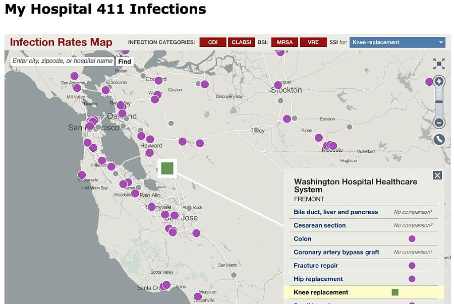
What if you were planning on undergoing a knee replacement surgery and you could click an online map to see in three seconds which hospitals in your area had infection rates for that procedure that were higher or lower than average?
What if you wanted to compare hospitals on types of infections, let’s say MRSA and VRE (vancomycin-resistant enterococci)?
And what if you wanted to burrow into the information and download a giant table with all the hospitals side by side?
See Also: Hospital Infections Drop After Rates Go Online
With the California Department of Public Health Infections Map, you can do all of those things. Last month, the department updated the information in the map – first released in January 2012 – and I found myself so engrossed in it that I nearly ran out of time to finish this post.
Here’s how one search worked.
I wanted to find out how hospitals in Orange County were doing with clostridium difficile. It’s a particularly nasty bug that messes up the digestive tract and can lead to an early demise. I typed in “Santa Ana, California” in the search bar. It pulled up a view that included that city and a few surrounding cities. I zoomed out so I could see all the other hospitals in Orange County and the neighboring metro areas. At a glance, I could see that most hospitals were average, but that there were a few standouts both positively and negatively.
First, the positives.
These hospitals had lower clostridium difficile rates than the state and national averages: La Palma Intercommunity Hospital, Western Medical Center in Anaheim, Coastal Communities Hospital in Santa Ana, and College Hospital in Costa Mesa.
And these hospitals had higher rates: Saddleback Memorial Medical Center in Laguna Hills, Hoag Hospital Irvine, Hoag Hospital Newport Beach, and Orange Coast Memorial Medical Center in Fountain Valley.
Then I downloaded information on all the hospitals to see a finer grain breakdown.
Not many people know about the map. It averages about 7,100 views per month. That’s not very many in a state of 38 million people. At that rate, assuming those are all unique visitors, it would take 446 years for everyone in California to see the map. But the numbers are up considerably and the trends show what can happen when an agency makes more information available to the public.
The map started with very little data. It showed surgical site infections as a broad category and included just four procedures: cardiac bypass graft, hip prostheses, colon surgery, and knee prostheses. How interested was the public in this information? Fewer than 1,000 people visited the site on average every month through August 2012.
That month, the agency gave the map a makeover. It expanded the types of infections reported to include central-line-associated bloodstream infections (CLABSI), MRSA and VRE. It also added five new procedures: cesarean section, open reduction of fracture, spinal fusion, small bowel surgery, and bile duct, liver and pancreatic surgery. The numbers shot up. There were more visitors every month after that than in the first eight months combined. The agency added clostridium difficile, too.
CDPH’s Corey Egel told me that the agency has a good sense of who those 7,100 visitors every month are.
“Much of the attention received has been from consumers, consumer advocates, healthcare providers, public health partners, philanthropists, software engineers and members of the Healthcare Associated Infection Advisory Committee and subcommittees,” he wrote me.
Earlier this year, the agency put together a focus group to see whether the map was useful. The consensus?
Ninety-percent found the map useful, 96 percent would share the map results with family or friends, 80 percent would share map results with their medical provider and 90 percent understood the symbols provided on the map legend. Almost all participants found the zooming in-and-out feature useful, when comparing hospitals. Additionally, the presentation of health data using an interactive map has been well received from software engineers who are very interested in the tool's ability to help prevent HAIs.
Compared to the cost of treating a runaway healthcare-associated infection, the map was quite cheap. An analysis in Virginia found that the costs of treating clostridium difficile in one year alone topped $157 million.
Given California’s budget troubles, the map would not have happened without some help. The California HealthCare Foundation gave the California Department of Public Health $75,000 to make the map, allowing the agency to hire the San Francisco design firm Stamen to create the page. Other states should take up the challenge and make it just as easy for patients to make comparisons.
Related Stories:
California tries to cure prescription drug tracking system
Researchers find painkillers don’t solve long-term problems
Why do so few medical implants come with warranties?

