
Racial disparities amid COVID-19 are more local than you might think, research finds

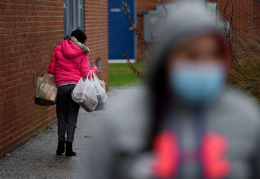
(Photo by Olivier Douliery/AFP via Getty Images)
As the COVID-19 pandemic took hold, researcher Elizabeth Wrigley-Field looked around her Minneapolis neighborhood and wondered how residents might be experiencing the pandemic differently, even within the same city or neighborhood.
In her own townhouse complex, for example, Somali families occupied one side while mostly white residents filled the other. How were their experiences different?
Drawing on census and death certificate data, Wrigley-Field and other researchers found that Black, Indigenous and people of color had much higher mortality rates during the pandemic than whites — even in neighborhoods that had the same degree of economic disadvantage. In other words, the differences in death rates couldn’t be attributed to simply living in poorer neighborhoods, according to the study, recently published in Health Affairs.
But that’s paired with another key finding: When it comes to COVID-19 mortality, living in the most disadvantaged area is vastly different than living in a somewhat disadvantaged area for everyone, but especially people of color. Just looking at race or economics alone would have masked the most severe disparities in COVID mortality. The intersection of race and place was key.
“What we found is that people of color who are living in the most disadvantaged metro areas were at a level of risk unlike everyone else,” said Wrigley-Field, an assistant professor of sociology at the University of Minnesota.
What the study found
While national data may tell the story of higher COVID mortality among people of color, the hyperlocal level revealed the devastating collision of urban poverty and race during the pandemic. For example, Black, Indigenous, and people of color’s adjusted mortality rate was 639 deaths per 100,000 population in the most disadvantaged neighborhoods, compared to 229 per 100,000 in the most advantaged. The same rates for white residents was 437 and 152 per 100,000, respectively.
Rates climbed even more for all groups if researchers focused on poor neighborhoods within a metro area compared to outside the city.
Understanding these hyperlocal distinctions has broader public health implications, Wrigley-Field said, and can point us to more targeted approaches to address inequities. For example, when vaccines were scarce, public health officials could have offered vaccines to very specific populations who were experiencing much higher death rates. Today, this information could inform decisions on where to target vaccine information and education for recently eligible children. And identifying specific neighborhoods can focus limited outreach budgets.
“When you’re talking about such a small area, you can go door-to-door,” she said.
In some ways, the study’s findings on race were surprising. Before the pandemic, white people in poor neighborhoods died at higher rates than Black, Indigenous and people of color in similar neighborhoods, researchers explained. The study’s authors at the University of Minnesota speculated that this was a result of life experiences that led them to those places in the first place, rather than the effect of place on their lifespans.
If you have the advantages that come from being white and still end up in a disadvantaged area, something else likely happened in your life such as incarceration or addiction, they speculated.
“Ending up there reflects a series of major disruptions in their lives,” Wrigley-Field said.
During the pandemic, though, that storyline flipped: People of color were at higher risk of dying from COVID-19 than white people in similarly disadvantaged neighborhoods. Researchers speculated that the families struck by such losses might have included a higher number of essential workers or people resided in crowded multigenerational households. It’s also possible residents of color might have experienced more comorbidities and worse medical treatment, they said.
Diving into the data
For this study, researchers decided to base their analysis on census tracts, which are roughly about 5,000 people, a number large enough to make the findings statistically significant but small enough to still capture a real social and physical neighborhood.
Data experts at the University of Minnesota were faced with a daunting data project — they had to do everything from cleaning up data on death certificates to clarifying ambiguity on geographical codes, Wrigley-Field said. Some data also had to be adjusted to make up for shifting populations over a short period of time and removing deaths from long-term care facilities to better reflect the neighborhood itself. For example, there could be more affluent people residing in a long-term care facility in a poorer neighborhood.
While it might be hard for most reporters to replicate this level of local scrutiny without that kind of institutional data support, the study’s findings offer an important lesson for reporters: Delve deeper into neighborhood patterns. If a reporter notices disparities at the anecdotal level, they can use publicly available census data to explore whether the data supports their observations.
For instance, there could be interesting stories in comparing adjacent census tracts — with similar levels of economic disadvantage — that might have distinct demographics and mortality rates. Census tracts can also sometimes have very different socioeconomic profiles, despite being right next to each other, and that can also be revealing, she noted. The challenge is knowing which areas to consider in the first place, a struggle that underscores the need for boots-on-the-ground local reporting.
When geography and experience don’t match
The study’s findings also offer a cautionary tale against using measures like ZIP codes as a proxy for neighborhood experiences. ZIP codes, created as a postal unit, don’t always correspond well to a neighborhood’s true boundaries. They lack granularity: You can live in a highly disadvantaged neighborhood within a much more advantaged ZIP code, she pointed out. They can even worsen existing disparities.
That’s what happened in California when the Department of Health’s vaccine distribution algorithm allocated vaccines based on ZIP codes, not census tracts, according to an ACLU blog post. While focusing on the hardest hit geographic areas was a good choice, ZIP codes weren’t the best marker of those disadvantages, wrote attorney Jacob Snow. “Here, the consequences of California building an algorithm to allocate vaccines based on ZIP codes rather than census tracts means that more than 2 million Californians — living in neighborhoods with the worst health outcomes, many of them communities of color — may not be given needed additional vaccine supply.”
That’s because underserved neighborhoods might be part of a higher-income ZIP codes, masking their poorer health and economic struggles. A better choice would have been the generally-smaller census tracts, which were designed to reflect health disparities, Snow argues.
In other cases, though, a broader look might be necessary especially if that’s how the data is collected. For example, Wrigley-Field pointed to the work of Boston University professor Andrew Stokes, who has looked into underreporting of COVID-19 on death certificates by counties and the characteristics of those counties. Choosing to focus on the county level makes sense in this case since that’s where death certificate decisions are made, she said.
What’s next?
The pandemic has forced researchers and reporters alike to revisit “business as usual,” Wrigley-Field said. The experience has also heightened the value of evaluating and exploring observations in real time.
For her next research project, Wrigley-Field is thinking about vaccine hesitancy, again turning to her own neighborhood. There is a history of the Somali community being targeted for misinformation on childhood vaccines and autism. Better understanding of this precise history and its likely outsized impact on COVID vaccination might influence targeted vaccine outreach efforts.
While a lot of people understand that the geography of vaccine decisions is complex, there is much more to find when you zoom down to that very local level.
“You uncover a process that wouldn’t be so obvious if you’re looking at the national polls,” she said.
**