
SXSW Interactive: Visualizing 'big data' for storytelling

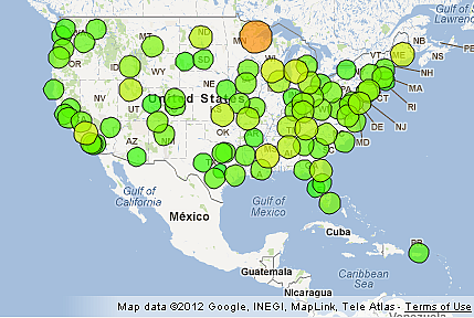
 The Environmental Protection Agency's radiation tracking website (Radnet) became very popular after the earthquake, tsunami and nuclear disaster in Japan one year ago today. At the time, the data on radiation was not very friendly to non-scientists. Visitors would see "Near-Real-Time Gross Gamma Count Rate Data" when they entered their zip codes and inscrutable charts with peaks and valleys that was cause for concern for people who could not really understand what they were looking at. It was scientific data that quickly garnered great interest from the general public. So others started creating mashups to help people make sense of the data, such as the map (left) created by graduate students Kevin Peter Hickerson and Riccardo Schmid at Caltech.
The "Transparency Memo" created a lot of access to government data. And SXSW Interactive panelist Laura Hermann isn't complaining. Data.gov is an exciting development, Hermann said, but it is important to contextualize and explain the data.
Hermann is the president of The Chicago Justice Project and and senior vice president for Potomac Communications Group. She works to help scientists to communicate to diverse audiences. In her presentation, Rethinking How To Communicate Science, she said that changes in how scientists need to handle data is done also is changing journalism.
The Chicago Justice Project wanted to open up data from the city's law enforcement agencies. But putting all the data from seven related agencies into one repository is a big task; privacy and public good have to be weighed. Hermann and her colleagues, along with volunteers, started "scraping data" to begin to "develop a common language" with government agencies to better understand how they interpret data. Coding is very important to cross-reference data between agencies such as law enforcement and health and human services. The Project made data sets available for download, but soon realized that data needs to be usable, needs to tell a story
It's a complicated, collaborative process -- and a work-in-progress -- but Hermann sees this kind of use of data as very relevant to journalists. The data scraping tool they created was set up initially using information from local news and it was interesting to look at the prevalence of news stories about crimes versus the actual data, which gave leverage to advocates and consumers who wanted to approach editors about imbalances in coverage. The data also serves as a foundation for investigative reports, which was the case with an earlier study of data on Chicago's police board.
Hermann says that it is important to create audience-centric visualizations that answers viewers questions before offering scientists' facts. There is a difference between the visualizations used for narration to an audience and those created for scientists' discovery. The EPA'a Radnet site has since been updated, but the lessons remain: If you give an audience inappropriate visualizations of data, they might misunderstand what they're looking at.
"If it's the wrong audience, they're going to figure out the wrong thing," said Hermann.