
Data powered my reporting on pedestrian deaths, but in-person reporting supplied the missing nuance

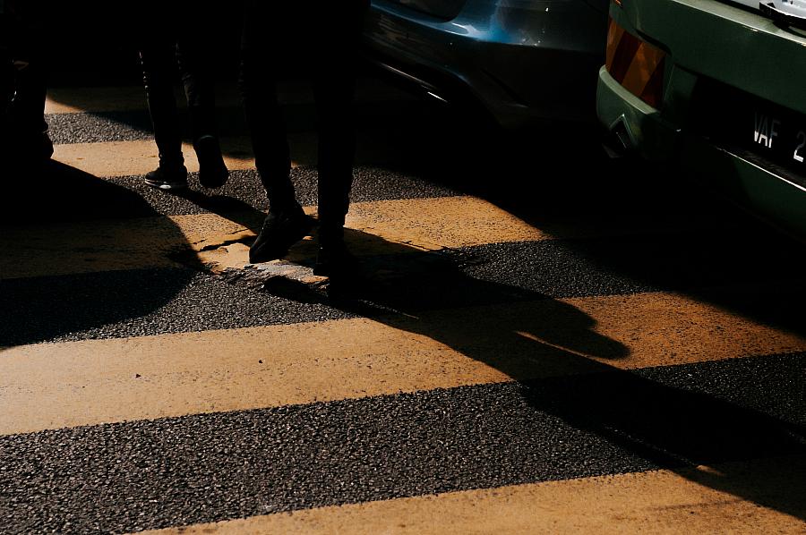
Photo by afiq fatah via Unsplash
News stories of pedestrian and cyclist deaths are often bare bones, as dictated by the grind of daily reporting. They usually include a time, place, age and gender, and sometimes a name. In Santa Cruz County, where I report, these stories are frequent. So are the stories I’ve heard from sources and friends about crashes and near misses while biking and walking — even before I started writing about traffic safety.
I wanted my reporting, supported by the 2025 California Health Equity Fellowship, to zoom out from individual experiences, to show the connection between street design, patterns of crashes, and the human impacts of traffic violence.
My starting point was the Statewide Integrated Traffic Records System, California’s comprehensive database of vehicle crashes. UC Berkeley's Safe Transportation Research and Education Center maintains a website with mapping and data tools that helped me comb through more than a decade of crash reports from law enforcement officials.
The data helped me create visualizations for my stories and identify trends in crash patterns. Equally importantly, it helped me find sources and shaped my in-person reporting. That reporting, likewise, gave me a more nuanced lens with which to interpret the data.
For my first story, I used the UC Berkeley data to create an interactive map of cyclist and pedestrian injuries and deaths. The map helped me target my search for sources with firsthand experience of traffic violence. Anecdotally, I knew which areas of the county tend to be the least friendly to people walking and biking. But the crash data helped me zero in on specific streets and intersections, especially in areas I didn’t know as well.
Watsonville, a city in the south of the county, is one of those areas. One afternoon, my Spanish-language interpreter Leonora Sanchez and I spent hours pacing a handful of wide, fast roads that topped the list of streets with fatal crashes.
After an hour of haphazardly chasing down pedestrians, we stumbled on a strategy I wished I had thought of earlier in my project: focusing on bus stops. There, we found people who had plenty of experience navigating the streets on foot, and had nothing better to do than talk to a reporter. Leonora, a Watsonville local, helped me find the most popular stops around the city.
Of the dozen or so people we spoke with, about half had been hit or nearly hit by a car. But none of those crashes were documented by police. In the database, they were invisible.
One advantage of shoe-leather reporting on street safety is the ability to experience firsthand the subject you’re covering. I’ve driven Highway 9, a two-lane, winding ascent into the Santa Cruz Mountains, dozens of times. I was somewhat surprised to find it was one of the county’s most dangerous roads for pedestrians — not realizing that even in this rural area, a sizable number of people get around without cars.
I had never walked the highway until I went with my photographer, Marcello Hutchinson-Trujillo, and had to chase down a pedestrian he had photographed for a quote.
Jogging the narrow space between the vehicle lane and a retaining wall, I felt a burst of wind from a passing car. I was standing a few yards away from where the subject of one of my stories, 19-year-old Josh Howard, had last walked before he was killed by a car in 2014. As I wrote about the crash, I drew on that brief moment of fear I’d experienced.
Josh’s mother Kelley had also walked in his final footsteps about a year after he died, she later told me. I sought out the survivors of cyclists and pedestrians killed by cars to show that these crashes are not just blotter reports, but far-reaching and lasting injuries to families and communities. A source I met, a traffic safety advocate, helped connect me with Kelley. Reaching other survivors was more difficult.
The state crash database does not include the names of those killed. While some victims are identified in quick-hit daily news stories, many are not. Some fatal crashes receive no news coverage, especially if the victim is unhoused or in a low-income area. To connect all the data points to names, I had to request public records from area law enforcement agencies. For each victim, I scoured social media and online memorials for family and friends.
I’ve conducted many interviews about painful subjects, and I feel confident in approaching those conversations from a trauma-informed perspective. But I felt conflicted cold-calling, emailing and Facebook messaging the long list of family and friends I found who had lost loved ones. My senior fellow, Emily Bazar, encouraged me to give these people the choice to share their stories — or not.
Most chose not to respond. But the few who did were eager to share about the people they lost. About the music they liked, the family they left behind. About the anger that remained, years later, about the circumstances that led to the crash.
It was difficult to collapse these stories into a few paragraphs or less. It was even harder to assess who should be held accountable for the crashes.
In the data I started with, each incident is assigned a single party at fault — the driver, or the cyclist or pedestrian. The truth is harder to capture. In 2017 Jennie Gervasio, 56, ran a red light on her bike in Watsonville. As far as the crash report is concerned, she alone bears the blame for her death.
That data point doesn’t consider the driver, who was arrested for speeding and who Gervasio’s daughter believes may have turned an injury crash into a fatal one. It also doesn’t consider California transportation officials, who designed a wide freeway that encourages drivers to travel at high speeds. Or city leaders in Watsonville, who over decades created a sprawling urban landscape that requires cyclists and pedestrians to cross several busy roads to go to the store.
Data is a powerful tool for shaping reporting and informing policy. But it’s also important is to consider what the data not showing. What complexities is it flattening to fit in a spreadsheet?