
Use this step-by-step data guide to chronicle the opioid epidemic in your community

![[Photo: John Moore/Getty Images]](/sites/default/files/styles/inline_image/public/title_images/unnamed_72.jpg?itok=SS7GiqIy)
For a few years now it has been widely acknowledged that an opioid epidemic has been sweeping communities throughout the United States. Although the hardest hit states such as Ohio or West Virginia tend to grab the national headlines, addiction has reached virtually every corner of the country.
In 2016, I set out to understand how opioids had impacted San Diego County. I did so using data and interviews with experts and the people on the front lines of the battle with heroin and prescription pills. What I found were young men, often white, dying in growing numbers in relatively affluent communities previously unexposed to the ravages of opioid overdoses.
The county coroner or medical examiner’s office is a key source of data for reporting on opioids. In my case, I requested data from the San Diego County Medical Examiner’s Office on overdose deaths for the previous 15 years, including demographic and location information. I used that to create a searchable map of opioid-related deaths per 10,000 residents in San Diego County ZIP codes. I also created an interactive that compared the demographics of opioid overdose victims to the overall county, as well as to overdoses from other drugs such as cocaine and methamphetamine.
In this guide I’ll explain how I obtained the data, and then I’ll walk you through a step-by-step tutorial on how to analyze data from your county’s medical examiner’s office. This includes tips on how to map the data so that readers can see where deaths are occurring in a given region or county.
When you do this kind of data analysis in your own community, it’s important to remember the reporting should be data powered but human driven. In my case, that meant telling the stories of Mark Gagarin and Aaron Rubin, both graduates from Poway High School who in their own way became addicted to powerful opioids. The stories of their struggles with addiction provide the human element that makes this kind of reporting meaningful.
The tools
For this guide, I’ll primarily use Microsoft Excel to clean and analyze the data from the various state and local sources. Most of the work can also be done using Google Sheets.
To map the data I’ll use Google Fusion Tables, a free tool available to anyone with a Gmail account. First-time users may need to activate the online app before using it.
Finally, although it’s not covered in this guide, in my own reporting I used Tableau to create data visualizations. Tableau offers a free option, and members of the Investigative Reporters and Editors organization can receive free access to the paid version. Depending on individual needs and newsroom specifications, other visualization tools include Highcharts, Plot.ly and Infogr.am.
Request the data
The medical examiner (or coroner in certain counties) generally has a wealth of knowledge on overdose deaths in your region. Harnessing their data can help illuminate noteworthy trends.
After conversations with a spokeswoman for my county’s medical examiner, I submitted a California Public Records Act request for the following information:
"For unintended deaths from drugs & medication, a gender, age, race/ethnicity breakdown, by drug/medication, from 2000 to most recent including ZIP code locations."
It’s worth discussing here why I used ZIP codes for location analysis. ZIP codes are easily understood and locals will generally have a good idea of the neighborhoods they represent. They are also used universally — ZIP code 92104 will mean the same area whether the data comes from the local, state or federal government.
They do have some disadvantages, however. They don’t always match up exactly with city or community boundaries. And while they normally contain a statistically significant number of residents, any one ZIP code might have anywhere between a few hundred residents and 40,000.
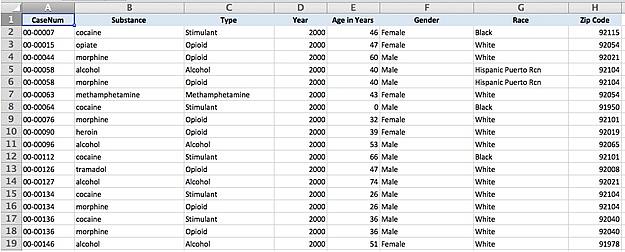
Here’s what the original data looked like:
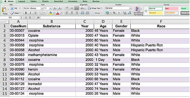
To use this data, we’ll need to standardize the substance names (making sure the spelling is consistent for all the substances) and ages (removing the word “year” and adjusting for “1 Day” in row 8). We’ll also add substance categories so we can group opioids such as morphine, heroin or codeine. We’ll also remove duplicates so one individual isn’t over-counted (for example, rows 5 and 6 are the same person, with the same case number).
This last step is particularly important because people often die from a combination of drugs. Each row in the spreadsheet is one of those drugs that appeared in the person’s toxicology report. Individuals are identified by their unique case number (or CaseNum in the column header).
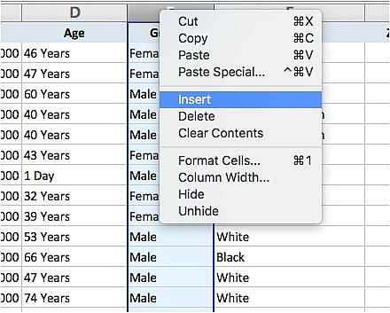
To start with, we’ll get rid of the “Years” text in the “Age” column. This will allow us to analyze the data based on the age of the victims, such as average age, age groups and more.
First, insert a new column to the right of the “Age” column:
Then, select the “Age” column:
Under Data in your Excel menu select “Text to Columns…”
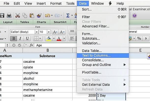
This will bring up a “Text to Columns” wizard that will walk you through the rest of the steps. For the original data type select “Delimited.”
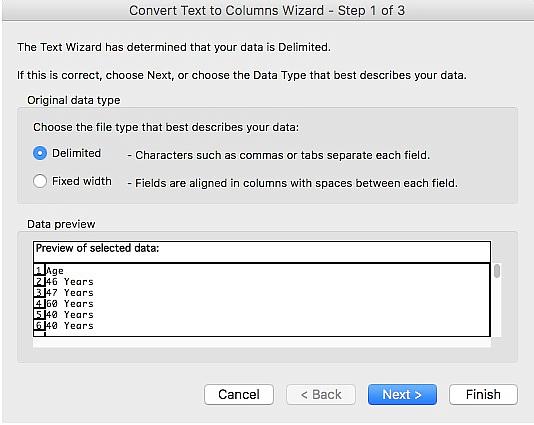
For “Delimiters” select “Space” and click Finish.
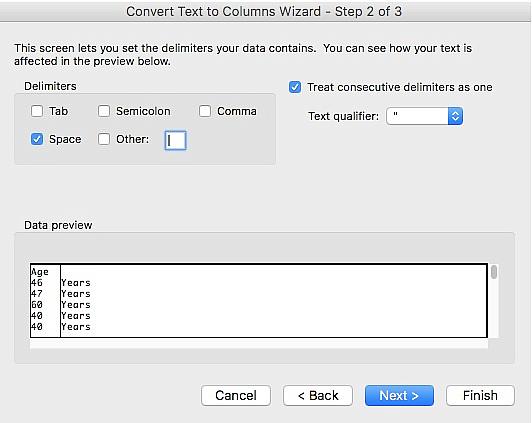
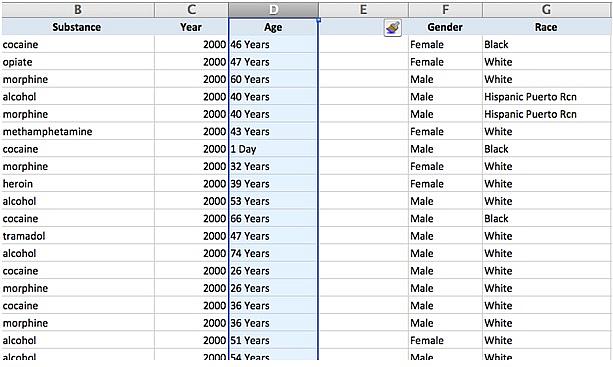
This will separate your “Age” column into two, using the space between the number and the word “Years” as the breaking point. For example, “46 Years” becomes “46” and “Years.”
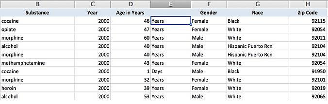
For clarity I renamed the original column as “Age in Years” and will go through every instance where the age was in days and change that to zero. Therefore, someone who died after 1 day will be marked in the data as 0 years. I then deleted the now unnecessary text column so it looks like this:
The next step is to add substance type categories to the data. This, unfortunately, has to be done manually. It’s the most time consuming step but a critical one for analyzing the numbers. One shortcut is to sort the data by the “Substance” column. This will at least show all of the same substances in a row. Here’s a quick primer on sorting in Excel.
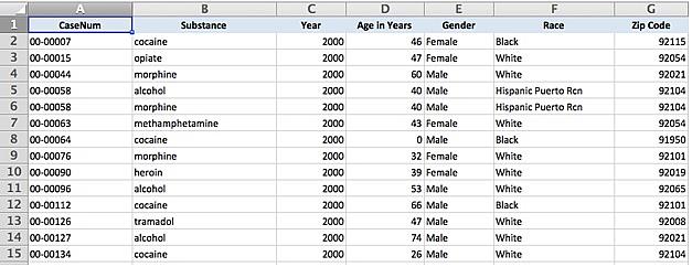
In the end, here’s how the data should look:
Next, we’re going to create a new worksheet that only has the opioid overdoses. We’ll then remove the duplicates from that new sheet.
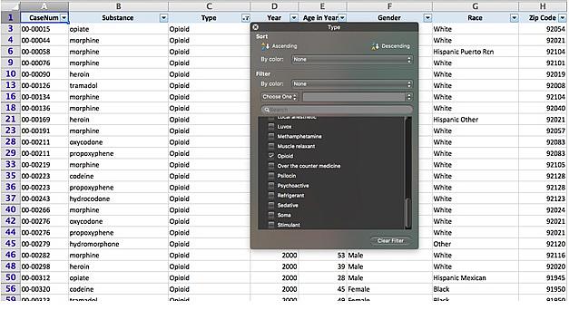
First, create a filter for the sheet, by selecting the filter button at the top of the Excel toolbar. This will add a small drop down menu arrow to each column. (Find a more detailed explanation of filtering in Excel here.)
Then, select the “Type” column and in the new filter menu de-select everything except “Opioid.”
Select everything that is left and copy it into a new worksheet. Here is where we’ll remove the duplicates. Select everything in the new sheet — I titled it “Opioids Only” to better keep track of it going forward — and click “Remove Duplicates” under the data submenu:
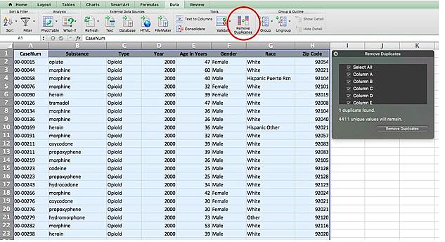
This brings up a small pop-up menu. Deselect everything except “Column A,” which has our unique case numbers. This will tell Excel to look for any rows that have the same case number. If two rows match, it will delete one of them.
An important note on this step: Because this act of removing duplicates randomly deletes one or more of the specific drugs for some individuals, don’t do any analysis on the “Substance” column. For example, if you wanted to know exactly how many people died from a heroin overdose, go back to the original data, which will include duplicates.
The first analysis we’ll run on this data is to group the individuals in the data by age group. To do this we’ll use the COUNTIFS formula. First, determine the age groups you want to use for your analysis, for example 0 to 10 years old, 11 to 20, etc. I went with five-year groups (0 to 5, 6 to 10, 11 to 15, etc.) because they match up with what the Census uses.
First, I wrote out the ranges I want alongside my data. (I created a copy of my opioids spreadsheet specifically for this to keep my data clean.) For the first age group, I used the following formula:
=COUNTIFS(E2:E3490,">=0",E2:E3490,"<=5")
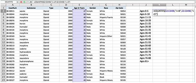
In this case, the E2:E3490 is the range of rows within the “Age in Years” column. The first criteria, “>=0” tells Excel to count that row if the number within it is greater than or equal to zero. The second criteria, “<=5” then tells Excel to count the row if the number is less than or equal to 5. A number has to meet both requirements to be counted.
When using this formula remember to include the range twice, before each of the criteria. It’s always important to make sure you keep the range identical for all the sums. (You can find more information on COUNTIFS formulas here.)
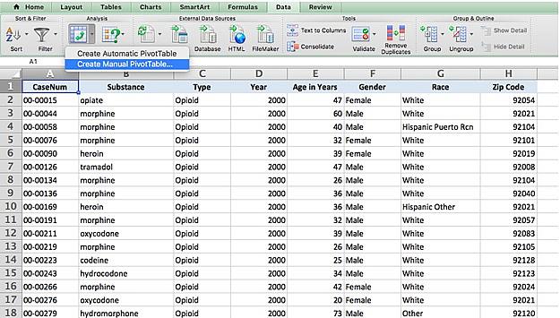
Next, we’ll use pivot tables to determine the breakdown of opioid overdose victims by race/ethnicity and by gender. You can find a more detailed look at pivot tables here, but essentially they allow for quick summaries of complex datasets.
First, go to your spreadsheet of opioid overdose victims where you removed duplicates. In the data submenu click on the drop down menu arrow next to “PivotTable” and select “Create Manual PivotTable…”
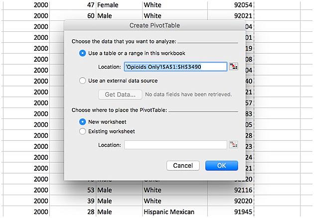
This will bring up a popup menu that will check the range you want your pivot table to analyze, which in this case is the entire worksheet. It’ll create the pivot table in a new worksheet. This should be the default setting on the menu, so click “OK” to create.
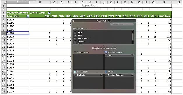
This will create a new worksheet with a blank table and a new popup menu titled “PivotTable Builder.” We’ll start by looking at the gender breakdown, so drag “Gender” to the “Row Label” box. We want a count of individuals by gender, so drag “CaseNum” to the “Values” box.
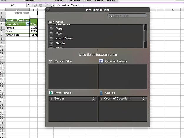
Following the same steps with “Race” in the row labels box shows a breakdown of overdose victims by race and ethnicity.
As you create new worksheets and pivot tables it’s good practice to clearly label all your worksheets. This will help make sure you keep your data in order as you go back to it days or weeks later.
As you do this analysis, also consider the historical range of your data. Do you want to know the gender breakdown of overdose victims for the last 15 years? Or just the last five? Looking at too large a window of time can hide ongoing trends, while too narrow a window can be easily skewed by random variation. Find the time period that best works for your analysis and be clear about it when presenting your data.
Comparing overdose data to overall regional demographics can also provide valuable context. For example, you can determine the share of overdose victims that are white compared to the county overall. A good source for demographic data is CensusReporter.org. This website creates easy to read graphics and provides the raw data from the U.S. Census Bureau.
Census Reporter generally pulls from the 2015 five-year American Communities Survey, which is more recent but less accurate than the full census. Depending on how old your data is you might want to consider using the 2010 decennial census data instead.
Mapping overdose deaths
The final step for this reporting will be to map overdose deaths by ZIP code. For this example I focused on deaths from 2007 to 2015, adjusted per 10,000 residents. This will give us a long enough window of time, starting with the time when my reporting indicated opioid deaths started to increase.
First, I created a new pivot table in Excel, this time with “ZIP Code” in the row labels box. In the values box I have “CaseNum” again, and I added a new variable: In the column labels box I dragged in “Year.”
This gave me a table where each column is the number of overdose deaths from opioids in a given year by ZIP code. I’m then going to add the number of deaths from 2007 through 2015. For the sake of simplicity going forward I’m also going to move the contents of this table to a new worksheet.
For this we’re going to use the SUM formula, which adds the contents of cells within a given range. I used the following formula:
=SUM(I3:Q3)
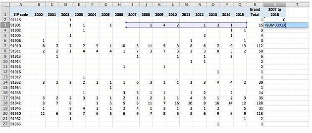
This tells Excel to add every number in row 3 from column I to column Q, which comes out to 12. Here you can see another valuable aspect for this grouping. From 2000 to 2006 there were three opioid deaths in this ZIP code, 91901. From 2007 to 2015 there were 12.
By adding the years in groups we can more accurately compare changes in drug deaths for a single community over time. It also helps reduce single-year increases or decreases so our data analysis is more accurate.
Once I’ve created the new sums I’ll move the results (the ZIP codes, and the deaths from 2017 to 2015) to a Google Sheets worksheet. I’ve also added the population numbers and a few other demographics measures to this sheet.
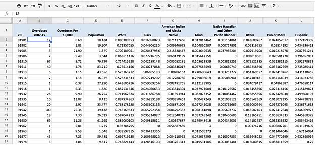
You can determine the number of deaths per 10,000 residents using the following formula:
= Number of overdoses 2007-15 / (Population / 10,000)
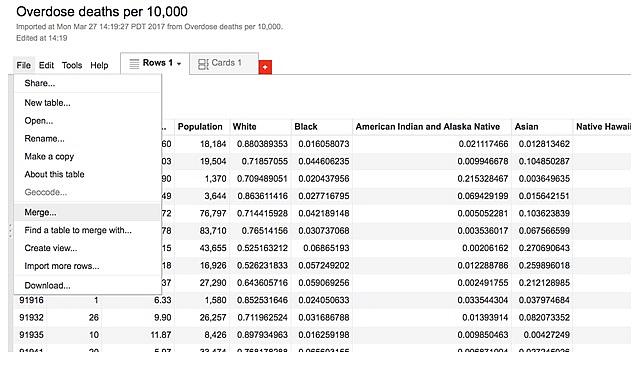
Then on Google Drive I created a new Google Fusion Tables file. This took me to a new window with a menu asking me to select a table.
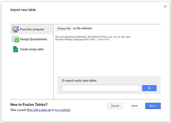
I selected “Google Spreadsheets” from the left side menu and selected the table I just created with deaths per 10,000 residents. This showed me a preview of the data, then I clicked “Next.” In the next screen give I gave my table a name. Don’t worry about having a detailed description for the fusion table in this step — we’re using this table to create a second table later on.
This table shows the data from my overdose spreadsheet. This has all the data but it doesn’t have the geographic information Google Fusion Tables needs to map the data. What I’m going to do next is merge this data with a fusion table that has map information for every ZIP code in California.
I clicked on “File” on the top left corner of the table and then selected “Merge…”
This will ask me to select a table to merge with. At the bottom of the pop-up menu there’s an option to paste a web address. I copied the following address there: https://www.google.com/fusiontables/DataSource?docid=1sI5oMIIywb1q-LwazKCthfxnwGNWhsnwsHudZCaa
This took me to a new table that asked me to list which column table will match a column in the new table, called ZIP_CA.kml. I’m matching my ZIP code column to the comparable column in the fusion table called “ZCTA5CE10.”
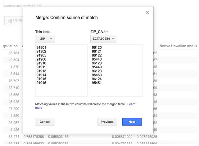
Once that’s done I click next. The next menu asked me to select which columns to merge. I selected all of them and clicked “merge.” This created a brand new table, so I clicked “View Table” to go to it.
In the new table, I clicked on the “Map of geometry” tab to see the new map. This should show all the ZIP codes in the region filled out.
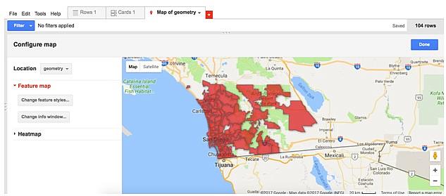
On the left hand menu “Change feature styles…” can adjust the colors based on the overdose ratio. Clicking on it will bring up a new pop-up menu. There, under “Polygons” and “Fill color” I can determine what kind of color I want to use, whether I want a gradient or buckets, etc.
For example, a gradient on the column with the number of deaths per 10,000 residents can make it so a ZIP code is darker the higher the ratio.
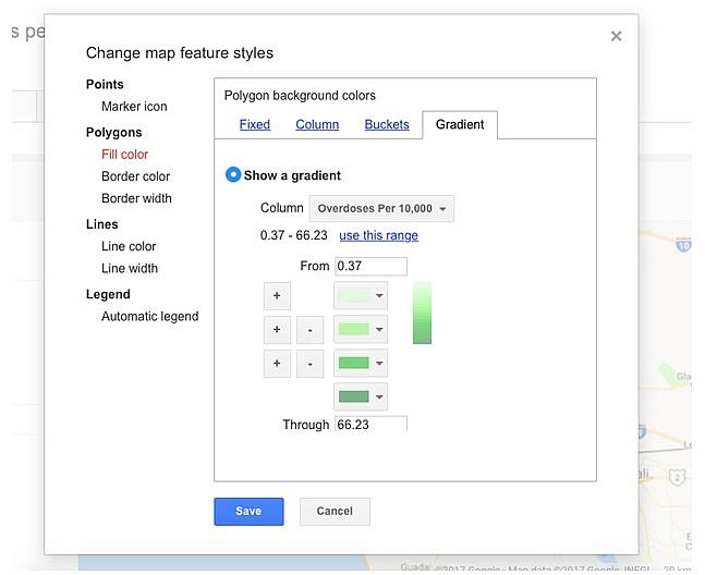
Find more information on what the different color styles mean and how to adjust them for what you want here. As you determine your colors, look for outliers that might make your color range meaningless and adjust your range accordingly.
The “Change info window…” button will bring up a pop-up menu to adjust the information window that appears when you click on a specific ZIP code. Learn how to adjust those here.
Spend some time adjusting the color and info window on your map before publishing, to make sure it is clear and meaningful for readers. Under “File” select “About this table” to adjust the name, data source and description of your table.

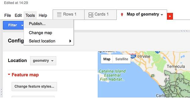
When you’re ready to publish your own map click on “Publish...” under “Tools.” Make sure your fusion table’s visibility is set to public. This pop-up menu will also give you the code you need to embed this map on your website.
Things to consider
As you work on your own data, there are some steps you can take to ensure the accuracy of your analysis. At the beginning of your analysis, always keep an original copy of your data set aside. This is useful if you need to go back and re-do something, and to make sure you can replicate any steps you take.
Always maintain a data diary — either a spreadsheet, document or notebook where you note what formulas and steps you’re using to manipulate your data. You should be able to give your original data and this diary to someone else and they should be able to get the same numbers and conclusions you did.
When in doubt reach out to researchers or other data journalists and ask them if what you’re doing makes sense. Investigative Reporters and Editors (IRE) and the National Institute for Computer-Assisted Reporting (NICAR) have group emails of journalists who can give you advice and a fresh pair of eyes on your data. Even your medical examiner’s office might have a researcher who is familiar with the data and who can give you some guidance on your analysis.
Even if not all of your analysis and graphics end up in your final story, this work will provide invaluable context and a strong foundation for your reporting.
[Photo: John Moore/Getty Images]