When the data isn’t there for the story you’re trying to tell

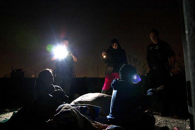
A homeless count in Los Angeles.
This was supposed to be a data journalism project, so I decided to plunge into every report I could find. But in the end, I wound up learning a big lesson in how even data from authoritative sources can be misleading.
Let me explain: My 2017 California Data Fellowship project was initially premised on one shocking statistic buried in a local report in Santa Clara County. Local officials determined that the number of homeless youth had tripled in just two years. This figure came from a biennial “point in time” count, conducted by the county on behalf of the U.S. Department of Housing and Urban Development (HUD).
The statistic seemed plausible. There were homeless families camping out in vehicles all around my city, and to any observer it sure seemed like the problem was getting worse. If the homeless population was skyrocketing so rapidly, then surely this would create serious health problems, or so my thinking went. I thought I had the makings of a killer story.
I spent a lot of time scrounging for reports that would uphold this working theory. I collected dozens of studies showing a nexus between homelessness and poor health. I chatted with the coroner and collected death reports for all the homeless individuals who died.
My problem was that my original working theory was flawed. After months of work, I finally got around to talking with independent experts in the field, and they described the myriad problems with the data in the point in time count.
For one, the report is loosely organized. Unlike Census data, which is collected directly by the federal government, HUD delegates this to local officials to do the work. In this case, that means going out onto the streets in early January and trying to count homeless people.
Some areas, such as Santa Clara and Los Angeles, are extremely diligent and they send out organized teams of volunteers to canvass the streets. But other areas clearly don’t take it so seriously. Officials in some rural California counties, I was told, don’t bother traveling around to count the homeless. Instead local officials just publicize that they’re doing a homeless count in town. For a few hours, if any homeless individuals come by, they get counted. Naturally, this ends up producing much smaller numbers, and sometimes it falsely makes the problem seem nonexistent.
The problems run deeper. Over the years, HUD has issued a variety of different criteria for what should be counted. One expert told me the agency had eight different definitions for youth homelessness. The end result is data that is hard to compare year to year, or region to region, because each report follows a different methodology. I ended up producing a data map that I believe provides interesting snapshots, yet it remains starkly inconsistent when you examine California as a whole.
As I was beginning to learn about these problems, I decided I needed a different data source for youth homelessness that would be more precise. Public schools seemed like a promising avenue since every adolescent is guaranteed a free education. Plus, the McKinney-Vento Homeless Assistance Act stipulates that schools must track homeless students.
This data has its own flaws. The school data only tracks students 18 years old and younger who are enrolled and don’t drop out of school. Plus, it is widely acknowledged that school districts apply different criteria and resources to their homeless students. In many districts, the school’s staff homeless liaison is the superintendent, adding one more duty to an overburdened administrator’s to-do list.
All of those inconsistencies make it difficult to track how youth homelessness is worsening, even though it is extremely apparent. One expert explained it was like one person counting only the red bricks, while another counts only the yellow bricks. How can anyone ever figure out how many bricks there really are?
This data problem became more than just a footnote; it ended up being a central theme in my final story. But sorting through all of this ended up burning a lot of valuable time that could have been spent on more interviews or other stories. Even worse, I already had spent time working on graphics and spreadsheets for a data set that was flawed, at best.
This experience has taught me one valuable lesson for any future data projects: Check with knowledgeable experts in advance. It might take some time, but you’ll likely save yourself some pain in the long run.
[Photo by Neon Tommy via Flickr.]

