How reporters used data to tell the story of a public health system gutted before the pandemic

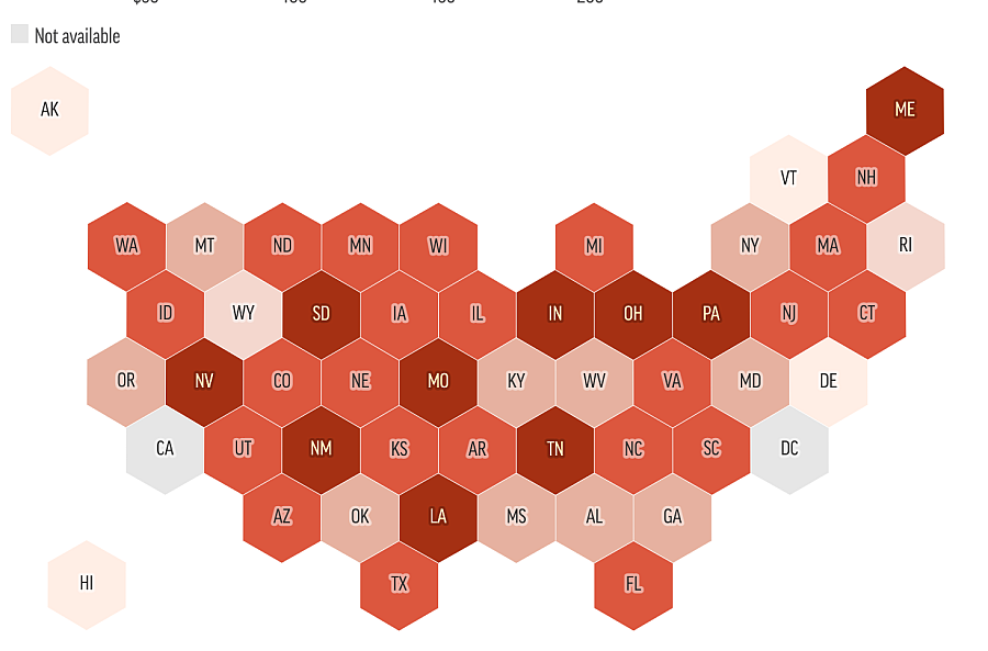
Most states spend less than $100 per person on public health.
(Graphic via KHN)
As the country rides an exponential COVID-19 curve into the depths of winter, one question keeps returning: How did the virus so easily overtake our collective defenses?
One of the ways journalists have sought to get at that huge question is by tracing how years of budget and staffing cuts left our nation’s public health system badly depleted on the eve of the worst health crisis in modern history. That’s what Kaiser Health News and The Associated Press did with “Underfunded and Under Threat,” a collaboration published in July that corrals a huge wilderness of federal, state and local data and interweaves it with narratives of overstretched public health workers on the frontlines. KHN’s Midwest correspondent Lauren Weber and data reporter Hannah Recht shared reporting insights and takeaways from the project with Fellows attending the Center for Health Journalism’s 2020 Data Fellowship via Zoom this week.
The U.S. public health system poses a formidable reporting subject. It’s vast, decentralized and fed by lots of different funding streams. Worse, there is no national data set for tracking key measures like staffing. (“We don’t have a public health system. We have hundreds, thousands of them,” Recht said.) The reporters overcame some of these challenges by the kind of reporting volley that journalists at smaller outlets can only envy:
“We discovered in talking to over 150 different health experts, local and state public health officials, and national experts that things are really quite bad for the governmental public health system in this country,” Weber said.
Spending on state public health departments has dropped 16% per capita since 2010, and local health department spending dropped 18% in the same period, their analysis found. The public health workforce has been hollowed out since the Great Recession, with 38,000 state and local public health jobs disappearing.
While those figures and the accompanying series of fascinating graphics were made possible by a deep bench of data journalism talent that included AP data editor Meghan Hoyer and KHN data editor Liz Lucas, the basic reporting methods the team used are familiar to journalists everywhere. “A really important way we found data for this project was talking to people,” Recht said. People led to data finds, and the data helped the team select the right people to profile.
Since the project was forced to rely on so many different sources of data from public health agencies of all sizes, comparisons between states or health systems posed one of the biggest challenges. Recht shared a few of the strategies they used for comparing apples to oranges, which included using per capita comparisons whenever possible. And using percent changes can make sense of data when raw numbers wouldn’t be meaningful. For instance, how much a state spent on public health spending wouldn’t be especially revealing on its own, but showing that expenditures dropped 55% per resident in South Carolina over the past decade, while staying flat in Delaware over the same time, is one way of making the data more intelligible.
But before all those reams of data could be sorted, analyzed and translated into comparisons readers can understand, the reporters first had to discover what data was available and pry it free. Recht’s advice: “Request data early and often,” she said. “Be really persistent when you’re talking to people, and build those relationships with researchers.”
When dealing with health departments, the more specific you can be in your requests, the better. For example: “I want the data underlying table 27 in this report.” When working with academic researchers, Recht said it can pay dividends to ask about overlooked sources of data that might not be published or spotlighted. The data point that brings your story home might be found in a researcher’s buried footnote.
Finally, imperfect data needn’t always be consigned to the dustbin, Recht told reporters. “Your data is going to be really messy,” she said. “It’s not going to be perfect. It’s going to have a lot of caveats — but it can still be really important.” As an example, she pointed to a color-coded map from the story that lit up social media, showing whether local governments spent more on policing or non-hospital health. Recht sees a litany of limitations and caveats in the data behind the map. But the team took pains to be precise in their wording, and when the main story published in early July, the comparison between health and police spending carried added resonance in light of the protests over police brutality.
If many of the knottiest challenges in reporting this project came from its national view on a thousand local stories, then those challenges are vastly reduced for reporters who want to localize to their county or state. Recht and colleague Laura Ungar teamed with AP’s Jason Dearen in Florida to tell how that state’s slashed public health spending and staffing left it especially undefended before COVID-19’s advance. That kind of story is something any reporter could regionalize for their coverage area, building on the data KHN has made public.
Part of the challenge in reporting such complicated and time-consuming data stories is maintaining forward momentum. Weber said she often gets antsy when working on longer projects, but finds keeping the faith is key.
“At the very beginning of this project, like a month and a half in, I was like, ‘Oh my gosh, I’ve talked to at this point probably like 60-plus people. What’s all going to happen?’” she recounted. “It all pays off. You don't realize until you have all the pieces what's all going to click into place. … The end result will be worth the constant waiting and being like, ‘Why is no one returning my records?!’”

