
How we analyzed the data to reveal surprising trends in the overdose epidemic


Illustration by Lucas Ian Smith
In October of 2024, at a local Investigative Reporters & Editors meetup in Chicago, Hannah Harris Green and I got into a conversation about an unusual trend happening in America: Drug overdose deaths were finally slowing down.
The latest annual count, for 2023, reported more than 106,000 lives lost across the U.S. — a slight decline amid a decades-long wave of opioid mortality.
This suggested a rare opportunity to explore a vexing question: What does it take to bend the curve of the overdose epidemic?
We were curious to see what 2024 would show. Months later, when the CDC announced an unprecedented 27% year-over-year decline, experts suggested a variety of factors at work, ranging from public health to law enforcement.
By this point, Hannah and I had a plan to dig deeper. The national numbers signaled an important shift, but the real stories — and statistical significance — were playing out at the local level.
In other words, we wanted to know what we could learn from the counties and states that were leading the trend, or falling behind.
By October of 2025, a year after we started asking questions, we had a few answers to share:
- A multipart investigation for The Guardian found overdose deaths continuing to rise in many communities, even as numbers declined nationally.
- Hannah’s statistical analysis showed that overdose mortality tracked closely with levels of fentanyl and, in some cases, methamphetamine in the local drug supply.
- We developed and published an open-source database of more than 10 data sets related to public health and demographics, organized at state and county levels, with historical overdose data going back years.
To pull this all together, we used a combination of approaches, including solutions reporting, data journalism and epidemiological analyses. We also had support from the Impact Fund for Reporting on Health Equity and Health Systems at USC Annenberg’s Center for Health Journalism.
Here’s how we did it.
Designing the database
While Hannah led the reporting and statistical analysis, I focused on designing and building the tools we would use to track the various data sets that piled up during our research.
Our goal was to keep track of every state and county in the U.S., along with annual data on overdoses, demographics, drug busts, public health initiatives and other data points going back up to a decade.
On their own, each data set offered one vantage point of the epidemic. Taken together, we could bundle that information into a multifaceted, localized picture of overdoses across America.
As a longtime data editor, and now a journalism instructor at Northwestern University’s Medill School, I try to focus on the basics and support teammates on these kinds of stories. This goes beyond research and documentation. Large, complex projects often benefit from bespoke databases and customized tools.
In this case, we had several journalists who needed to load, analyze and verify data – each using their preferred toolkit.
Hannah, who entered a graduate program in epidemiology at Northwestern’s Feinberg School of Medicine, was ready to put her statistical skills to work using the R programming language.
Andrew Witherspoon, a visual journalist for the Guardian who would develop maps and visualizations for our stories, worked in JavaScript, the language of the web.
And Will Craft, the Guardian’s data editor, used Pandas, a data science toolkit that is part of the Python programming language. I also work with Python, but not usually Pandas.
We needed a common language. I decided to start with SQLite, a database engine that handles relationships between tables. It can churn through millions of rows without skipping a beat. Best of all, SQLite offers a standardized format that is accessible to Python, Pandas and R users for analysis.
SQLite doesn’t have everything. It’s not good at cleaning messy data, it has severe limitations in math and isn’t designed to analyze timeseries, to name just a few deficiencies.
For those reasons, I used Python to augment what SQLite could do by itself. This is a concept known as object-relational mapping. Many data journalism projects have relied on the famous Django ORM. For this project, I decided to try out Peewee because it seemed a bit more streamlined.
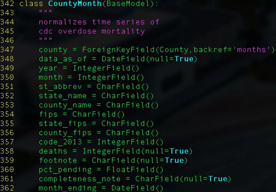
A screenshot of our database model.
Illustration by Lucas Ian Smith
I also tried to automate every step in the process. This is helpful for turning around quick updates after methodological revisions and avoiding surprises during fact-checks.
Finding stories in the database
From the outset, this reporting project seemed like a long series of mostly straightforward steps. Collect the data, clean it a little and load it up. Eventually, we would get to the more interesting parts, analysis and visualization.
But even simple calculations would require careful consideration and extra processing steps. Case in point, measuring change over time.
One of the earliest questions we sought to answer was how U.S. counties compare when ranked by change in overdose deaths. Early in the process, we were able to generate a quick spreadsheet using raw totals that helped us map out a rough coverage strategy, including Hannah’s reporting trip to Alaska.
But our published reporting would require more context and greater precision.
First, we had to make sure we understood nuances of how the numbers were tabulated. For instance, mortality data compiled by the Centers for Disease Control and Prevention are published monthly, but those numbers reflect totals for a 12-month-ending period. If you want to compile that data by calendar year, for example, you would need to filter for the month of December.
Along the way, we noticed limitations in our simple percent-change approach and made adjustments. Instead of comparing the earliest data from 2020 to the latest available, we decided our “before” snapshot should start at what is generally considered the peak of the epidemic, which is the 12-month period ending in August of 2023.
And when you think about it, raw totals are not the most reliable indicator, even when distilled to percent changes. We decided to fold in population data so we could see per-capita percent changes.
And then you realize that populations change, even year to year. Those changes needed to be reflected in per-capita mortality rates, year by year. So we collected annual population data for every county and state, which required loading and joining many more census tables.
It’s also worth pointing out that the CDC didn’t have mortality data for every county in America. Those counties reporting fewer than 10 deaths in a 12-month period would suppress totals to avoid potentially identifying causes of death for specific individuals. These were likely lower-population areas but they accounted for roughly two-thirds of U.S. counties, which added some design challenges for rendering a color-coded map.
These are just some of the issues we had to sort out, and why it’s important to open-source this kind of work. Other journalists and researchers can use our time-series, or borrow from our methodology, to speed up their process. Why reinvent the wheel?
What’s next
We hope the database can help local journalists understand historical trends in their communities.
We also want to keep the database up to date, relying on automation more than manual updates.
If you are interested in reporting stories from the database, or helping to maintain it, please reach out to me at matt.kiefer@northwestern.edu.