
Use this dataset and tutorial to understand what Medicaid looks like in your California county


John Moore/Getty Images
With the debate over American health care system likely to rage for a while, reporters have no shortage of stories right now.
But one thing the discussion of the American Health Care Act has revealed is the enormous part that Medicaid plays in providing health care to people — and how little reporters often pay attention to it.
The argument for covering Medicaid more closely is compelling:
-
16 percent of national health care spending is through Medicaid
-
74 million Americans are covered through Medicaid
-
Half the gains in insurance coverage since the Affordable Care Act passed were actually through Medicaid expansion
And in few places is that more important than California, where a third of the state’s population is insured through what it calls Medi-Cal. The program accounts for almost 25 percent of the state’s budget.
So, let’s walk through a quick recent history of Medicaid in California and then step through a spreadsheet that can help you cover your local California community.
Before the ACA, Medicaid covered the disabled, people with incomes at or under the poverty line, and children. With the adoption of the Affordable Care Act, states were allowed to expand Medicaid benefits to adults whose incomes were as high as 138 percent of the federal poverty level (the 2017 FPL figures are here).
California was one of the 32 states (Kansas is considering expansion as I write this) that took the federal government up on its offer, opening the program in 2014 to a wider audience.
As late as 2013, experts projected that on the high end, the ACA would add 1.42 million to Medi-Cal’s enrollment by 2019 — mostly through the expansion, but also through increased efforts to simply get people insured, by enrolling previously eligible folks who hadn’t signed up.
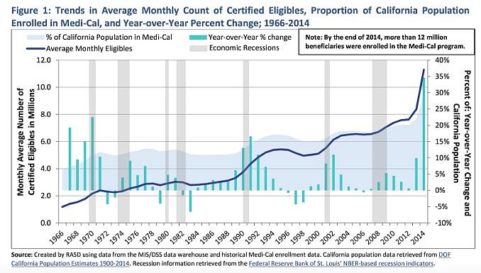
It turned out that estimate was just a little off. Instead, Medi-Cal added nearly 5 million people in less than four years — 3.7 million of whom fell under the expansion act. The nearly straight-up line at the end of the chart below shows what enrollment looked like as expansion was enacted, resulting in the biggest single year of growth in recent history for Medi-Cal.
At this point, half the children in the state are insured through Medi-Cal.
Possible changes to the federal funding formulas that provide the state much of the money to operate Medi-Cal would obviously make a huge impact on California’s budget — something Gov. Jerry Brown has already started talking about as legislators work on the 2018 numbers.
So, want to learn more about Medi-Cal’s data?
Here’s where to start — you’ll find monthly enrollment reports, some general health statistics and links that will eventually get you to places where you’ll find data on drug spending and utilization. In some cases, the data is out of date — I’ve found in reporting on California that this is often because the state has failed to update its website, not because it no longer keeps the figures, so it’s always worth calling.
The best place to look first is here, at the “Fast Facts” — which will give you a month-by-month enrollment overview and a quick demographic breakdown of who’s receiving Medicaid. You’ll see that most Californians are on managed care, not fee for service — which means utilization and diagnostic data will be hard to come by. But you can see here that nearly half the Medicaid recipients in the state are Hispanic, more than 40 percent are under 20, and that recipients are majority female.
To see how enrollment has grown in your county over the past four years, stay on that above link and scroll down to the “County Pivot” Excel link. Download the spreadsheet, and click over to the “Pivot” tab. On Row 10, you’ll see the word County in blue, and if you click on the little arrow next to (All) in B10, you’ll be able to choose your county or a specific group of counties to see growth trends since 2012.
To get at other local trends and Medicaid info, we’re going to use a cleaned-up version of another spreadsheet you can find on this page. It’s poorly named, but if you’re interested in county-level enrollment details, you’ll be looking for the “ACA Expansion Adult Age 19 to 64 as of (most recent month)” folder, like this: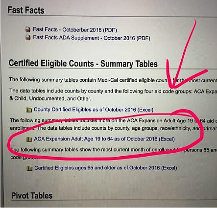
So, open the cleaned up “Medi-Cal_enrollment_Sept2016” spreadsheet and let’s get started.
First, get familiar with your data — you’ll see the county names in Column A, then two columns of population figures, and then the Medicaid enrollment numbers. Totals are along the bottom in row 61, separated from the rest of our spreadsheet so they don’t throw off sorts or other work.
The total Medi-Cal enrollment for your county is in column D. If you add column E (the expansion adults) and column F (all the “Traditional” Medicaid recipients, who are then broken down by age groups in columns F-I), you’ll see they add up to the Total in Column D.
There are no children or adults over 65 covered under the Medicaid expansion, so the expansion group is not broken down by age.
So let’s get a sense of the impact Medicaid has on your county. We’ll do this by figuring out the percentage of all people on Medicaid in your county, and then the percentage of children on Medicaid in your county.
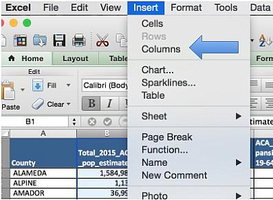
To do this, we need two additional columns, so click on the B above “Total_2015_ACS_pop_estimate” and highlight the entire column B. On the top bar above your spreadsheet, click on Insert and choose Columns. This will shift all your data to the right, creating a blank column in B. Repeat this step.
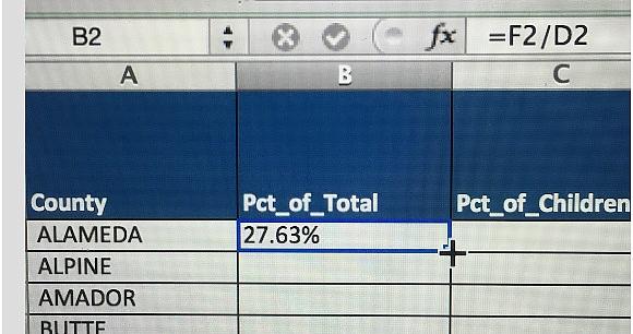
In row 1, name the new Column B “Pct_of_total” and the new Column C “Pct_of_children”
In cell B2, we’ll type the formula to get the percent of people in Alameda County on Medicaid. So that’s going to look like: Medicaid Enrollment/Total Population
Instead of typing all the numbers into Excel again, you can use a formula to point to the data you already have. In Excel, all formulas begin with an equal sign — it’s how the program knows you want it to do something.
So: you’ll want the equal sign, then the contents of column F, “TOTAL_Medi-Cal” divided by the contents of column D, “Total_2015_ACS_pop_estimate”
Type this into B2 =F2/D2
If you hit return, you’ll see the number, expressed as a decimal, pop up. If you want to make that look a little friendlier, got to the top bar and click on Format → Cell → Percentage and choose two decimal places. Your number will now be 27.63% — that’s the percent of all the people in Alameda County who are on Medi-Cal.
Instead of making you type that formula again and again, Excel has a handy trick: Take your cursor and move it over the bottom right-hand corner of cell B2. You’ll see it change from a big white cross to a thin black one.
When it looks like the above, double click, and your formula will be filled down the entire column. Now we’ve done the math for the entire state.
To determine the percentage of children on Medicaid in each county, we’ll want to do something very similar — only now our formula in C2 will be Column I, “Traditional_Medicaid_0-18” divided by Column E, “Total_under18pop_2015_ACS_Estimate”
So in C2 type =I2/E2
Change the formatting again by going into Format → Cells and then picking “Percentage” from the popup box. (You can also reformat by clicking on the percentage sign on your toolbar, or choosing “Percentage from the drop-down menu in your toolbar). Fill your formula down the column by mousing over the bottom right-hand corner of cell C2 under you see the thin black cross and then double clicking.
Now that we have the county proportions of all people on Medi-Cal and children on Medi-Cal, let’s do some sorting. Somewhere on your toolbar, you likely have buttons that look like this:
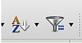
The left-hand A->Z is a sort button. If you click on any cell in Column C, the percentage of children column, and then go to the toolbar and click on the sort button, all your data will be sorted from smallest to biggest (ascending). Click on the little arrow next to the sort button to sort descending, or click it again after sorting ascending, to get the county with the biggest share of children on Medi-Cal at the top.
By sorting this way, you’ll see that in eight California counties, three out of every four children receive their health care through Medi-Cal. Is this a story? It might be, if there are discussions to curtail or change Medi-Cal benefits. But it certainly gives you important context for reporting on Medi-Cal in your area and statewide.
The second of those buttons is the filter button. If you click on Row 1, highlighting the header column, and then click on the filter button, you’ll see arrows appear next to each column name. Click on these arrows and you’ll be able to filter the column for whatever you’re looking for. So, if you want to only look at a few counties, or take only counties where Hispanics are more than half the Medicaid population, or anything like that, you can use your filter tool to do it. Just click off “Select All” and manually choose what you’d like, or click on the “Choose one” button to find filtering tools like "equals,” “greater than,” or “contains.”
These tools alone will allow you to do enough data work to gauge some of the local effects of what folks are proposing in Washington. Supplemented with state analysis such as this from March 21 and the work being done by a number of national and state health policy organizations, you’ll be much better armed to cover this topic in your community.
**
Related: Find the cleaned-up Medi-Cal datasheet that Meghan uses above here.